
Billboard Hot 100 How Changes Change the Charts
Billboard Hot 100
How Changes Change the Charts
GA-DSI Project 2
Billboard Methodology
Billboard Magazine’s “Hot 100” has been the barometer of what the most popular music in the country is each week for decades, making it a readily available measurement of “what we like” in music.
Billboard’s methodology has always included a combination of radio play and sales but over time the way these things were defined and collected changed which begs the question:
If the basis of measurement for what we like changes over time, then before we can consider the impact of the qualities of specific entries (e.g. artist gender, song genre, duration, seasonality, etc.) we need to consider the impact of the system itself.
The initial question for this assignment was about the songs most popular in 2000 so my initial focus was on the impact of changes made in December of 1998:
* Additional radio formats, including R&B, mainstream rock, AAA, and country, were added to data collection
* Weighting of sales in the calculation was cut from 40% to 25%
* Songs unavailable for sale as singles would now be included.
This last item might sound like a throw-away, but record labels had taken to distributing songs, referred to as album cuts, to radio stations but not put them up for sale until after they had gotten very popular. The song would then debut on the Hot 100 very high in the ranks, if not at /#1, after which they would decline quickly since listener fatigue would already have set in.
Theoretically these changes should have resulted in a decrease in the average debut rank and a lengthening of the duration of songs on the charts.
While the scope of this paper is on the potential impact of methodological changes on the chart from a high level, it should be noted that individual entries could be outliers, skewing the data.
Data collection, import, and cleaning
An Internet search uncovered this database of the Billboard Hot 100 from 1940-2015 http://bit.ly/2dao3Yn
To clean it I first converted the .txt file to .csv using code found on Stack Overflow and converted the resulting list of lists to a Pandas dataframe.
Finally I reformatted a “chart date” column to only reflect the year and converted appropriate columns of data to numeric dtype.
Data analysis
My first step in analyzing the data was creating a pivot table showing the mean, min, and max for entry position (the rank a song had when it first appeared on the chart) and the overall number of weeks a song appeared on the chart.
To visualize the data I created line charts based on:
1. mean and min entry position on the chart per year
2. mean and max number of weeks on the chart per year
3. number of artists represented on the chart per year
Expanded Scope
Looking at the data it was immediately clear that there were other major shifting points in chart performance. Exploration revealed additional significant changes in methodology in recent years:
-
1991: Data collection moves from reports submitted by radio stations and retailers to observed airplay via electronic monitoring of radio stations in 85 markets and actual sales records, both collected by Nielsen.
-
2005: Electronic transactions (e.g. buying songs from iTunes) were added to the methodology.
-
2007: Streaming and on-demand music was added to the methodology.
-
2013: Official videos and authorized audio on YouTube added to the methodology.
Entry Position
The 1991 change to electronic data collection from self-reporting by stations and stores had a strong impact on the ability for an artist to debut high in the chart with the strongest debut that year at /#15, the best in any year since 1970. It is unusual that the spike in the top debut did not have a corresponding rise in the average debut rank.
One of the expected outcomes of the change in late 1998 was to eliminate the artificial high-ranked debuts of songs onto the charts that was the result of album cuts “schemes.”
This appears to have worked as the average entry position for a song onto the Hot 100 fell from 56th in 1998 to 73rd in 1999. There were actually no #1 debuts from 2000-2002. While this could be due to record labels scrambling to find another way to get their artists to debut at /#1 there are no data to support that claim.
The average entry position for songs plateaued, then fell again from 2004-2006. This number then turned around, steadily climbing as Billboard took greater stock in new technology with their changes in 2005 and 2007. These changes had a similar impact as album cuts, with audiences getting exposed to music online before it rose to national attention and hitting the charts.
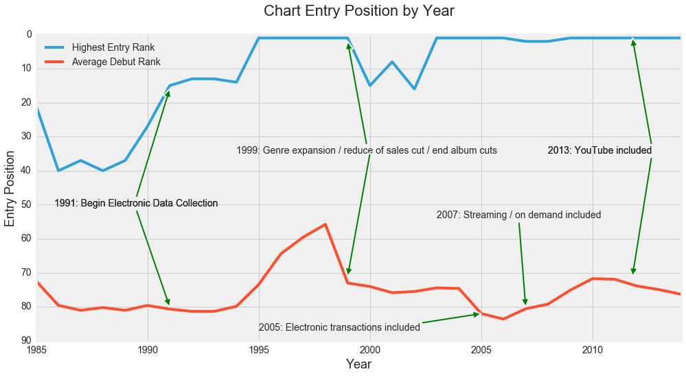
- Please note that the y axis is inverted–a lower number is a higher ranking.*
Number of Weeks on the Chart
The change in data collection in 1991 led to a temporary drop in the top number of weeks a song spent on the chart, though after that this measurement saw gains through 1998. There was also a gain in the average number of weeks a song spent on the charts from then until 1996.
The 1998 change was meant to eliminate the high start / quick fall effect of album cuts but these data do not reflect that being the case–it was much the opposite. A more detailed examination of the data could reveal the extent this measurement would have changed had the genre expansion and reduced weighting of sales not been implemented at the same time.
The inclusion of electronic purchases in 2005 and of streaming in 2007 both grew the top tenure on the chart, though the 2013 addition of streaming official videos online brought unprecedented longevity.

Average Number of Artists Appearing on the Chart
The changes made in the methodology over the years have often resulted in greater opportunity for a variety of artists to appear on the Hot 100 so it seemed appropriate to look at the extent to which this was true. Unfortunately this metric is tremendously chaotic with peaks and valleys lining up with changes in methodology as often as not. While there does appear to be an overall gain in diversity it is not possible to give a theory as to what has driven it from the data at hand.
